Pinch of Fire
This project started in the spring of 2022, my sophomore year of college where the class was to create a logo using a force connection between two random objects. I was assigned to create my logo, combining insects and food.
Let’s Start From
the Beginning!
This project started in the spring of 2022, my sophomore year of college where the class was to create a logo using a force connection between two random objects. I was assigned to create my logo, combining insects and food.
Before jumping into Illustrator, I began by creating a list of every insect and every piece of food I could possibly think of. I decided this as my first step because I wanted to get all of my initial ideas out before forgetting potential assets for my logo. After writing my thoughts out, I began sketching my ideas for food and my ideas for insects separately. This helped me find forms within my sketches to merge them later together.
The next step was to start combining forms between insects and food. I played around with different styles - some more friendly and bright and other more edgy and dark. After sketching about 50 different options, I narrowed my ideas down to my top 10 choices. I then drew them in Sharpie and scaled them up to fit two on an 8.5x11 page.
After presenting my top 10 ideas to my classmates, I received critiques on which ideas were stronger than the others. While some of these ideas were strong concepts, I felt as though the form on some of my favorites needed to be reworked to really give them each their own character and to push my concepts. I chose the top 3 ideas that were voted on by my peers and decided to finally move over to Adobe Illustrator. Here, I was able to rework the form of my idea of the scorpion and pepper, changing the pepper from forming just the tail of the scorpion to having the pepper become the body and tail of the scorpion. After digitizing this concept, I fell in love with the idea and wanted to continue working on the form of the scorpion.
I decided to continue with the pepper and scorpion idea as my final logo for this project. I felt like that idea was really strong and also really clever since the forced connection matched so well together. The idea of a scorpion being strong and painful and the idea of how eating a really spicy pepper can also be painful fit together really well and I wanted to really sell this logo idea. I reworked this idea over the next two weeks until I landed on my final logo.
Final Logo (2021)
FAST FORWARD TO 2023
When looking over my portfolio in the spring semester of my senior year, I wanted to choose a previous project that had great potential and refine it to then expand it into something a bit bigger in concept. After looking through my past work, I knew I wanted to refine my scorpion/pepper logo since I knew it had potential but when I first designed it, I was still learning Illustrator since I had only learned it a year before designing this logo. Now as a senior, Illustrator has been my go-to software for the past 2 years. My skills have been polished and I wanted to make this logo 10x stronger I found expanding this project would be really fun and exciting to see my logo finally come to life.
I began this refining process by looking at images of king scorpions and paying close attention to the angle of the scorpion, then adding in the pepper shape. I looked back at my previous version of this logo and decided to keep the idea of fragmented legs to incorporate the gestalt principle of proximity. I mainly wanted to focus on refining the body and tail of the scorpion. I decided to move away from Illustrator and start by drawing out peppers placed at different angles. I really wanted to have some sort of perspective on the scorpion and play with the angle of the pincers and head of the scorpion to be closer in view than the tail of the pepper. After finalizing the shape and form I wanted for the pepper/body of the scorpion on paper, I moved to Illustrator. I used a series of circles, varying in size, and the shape builder tool to get the shape I was wanting. I made other adjustments such as the highlight on the pepper and also the shape of the pincers. I wanted something more dynamic and I also wanted to create a secondary forced connection by having the pincers mimic the shape of flames.
Final Logo (2023)
Expanding My Logo
The next step after finalizing my logo was to expand it into something bigger than just a logo. After thinking this portion of the project over, I decided to play into the spiciness of pepper and wanted to create a hot sauce brand! When I spoke with some of my peers along with my professor, they all loved the idea so I knew this was going to be a really good fit for my logo. The first step was to look around for some inspiration and ideas of what kind of aesthetic I wanted for my hot sauce brand. I first looked through projects listed on Behance from other designers that related to hot sauce brands. I then looked through Pinterest for inspiration related to vintage Mexican and Tex-Mex poster designs. I loved the idea of bringing in the Tex-Mex look and wanted to pay homage to the reoccurring design of overlays and textures that many of these vintage posters had. I created a moodboard, consisting of all the ideas I had after gathering inspiration that I would look back on throughout the process of creating this brand.
I then started to think about the name I wanted for my hot sauce brand. I created a list of words that related to scorpions and a separate list of words that related to peppers. I then combined words and played around with different verbs and adjectives that could relate to both words. I then created a list of over 50 possible names and then started to cross out the names that were hard to compare to some of the stronger options. I condensed the list of names down to 24 strong options and presented them to my peers to vote on their favorite ones. After receiving input, I condensed the list again, leaving my possible names to down to 8 contenders. I thought over these names and decided between two - ‘Hot Pinch’ and ‘Pinch of Fire’.
I debated on whether or not to change ‘Pinch of Fire’ to ‘Pinche Fire’ to play more into the Tex-Mex aesthetic but feared it wouldn’t sit right with people. But after repeating ‘Pinch of Fire’ over and over, it almost sounds like "Pinche fire” so in order to incorporate that somehow, I decided on ‘Pinch of Fire’! Next was finding fonts and deciding how I wanted to create my brand. I tried many fonts that I found after a few days and landed on Charcuterie Block as my primary font, used for my word mark/secondary logo, and Neuzon-Regular as my secondary font, used for copy and language on the labels.
Next was to create a color palette that related back to my moodboard and to the Tex Mex culture. I started off with 3 options, debating on which direction I wanted to go with - traditional Mexican colors, or colors that were also inspired by the lotortia cards that I grew up with. I decided on a color palette that was bigger than just 5 simple colors. I created a primary color palette that I would use primarily for my logos, copy and labels but I also created a seperate color palette that I would use for my fun language I wanted for each of my labels.
After finalizing my color palettes, I started to design my labels. I wanted a series of 3 different hot sauces, ranging in levels of spiciness. I wanted each label to correspond with the level of spice, meaning the first level would be the lightest color in my color palette and the third level would be the darkest color. I wanted to have fun with naming each level rather than having ‘mild, hot, etc’. I wanted my hot sauces to be super spicy to make my brand stand out so I decided on the names ‘Flamin’ Hot’, ‘Lethal’, and ‘Inferno’. There is no such thing as mild when it comes to Pinch of Fire!
Each one of my labels would have a small excerpt of what my brand is and what it’s about, fun language in both English and Spanish, the Scoville level of each hot sauce, and an emblem to show that this brand is from San Antonio, Texas. For each jar, I also included a top label that would be placed on the lid so that customers would be able to see which flavor they are getting by only looking at the top. These lid labels included icons I designed and also my language to tie the main label to the top labels. I also wanted to mimic the look of textured paper to sell that overlaying effect of type on a paper that I loved when looking at and creating my moodboard.
Photography
Once my labels were all designed and finalized, I knew I didn’t want to find a mockup and place my designs on top and call it a day. I wanted to take my project a step further and attempt to photograph a physical comp of my jars. First, I went to my local HEB and bought 3 jars of hot sauces, ranging in different colors, and printed each one of my labels (main and lid labels), cut and placed them on 3 jars. A few days later, I was ready to photograph my jars so I made another trip to HEB and proceeded to buy peppers and tortilla chips to help support my jars. I had the help of my professor to help art direct as this was my first time adding in elements besides just my comps. I decided on a red background to help give it some color and to help my jars really pop out. I played around with the different colors and shapes of the peppers I bought, I even cut one into slides to add to my photographs.


AWARD WINNING
•
AWARD WINNING •
Salute Design Competition 2023
Best in Graphic Design: Packaging Design
On The House
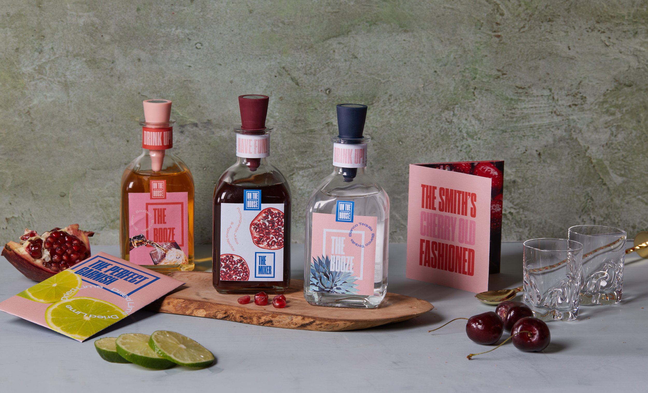
In this packaging project, the major goal was to create a subscription service which we were to create its brand and design it accordingly to relate to our ideal consumer. I chose to create a cocktail kit that is delivered to your home and is personalized for each customer.
Let’s Start a Tab!
In this packaging project, the major goal was to create a subscription service which we were to create its brand and design it accordingly to relate to our ideal consumer. For my subscription service, I bounced around a couple of ideas and wrote them out to see how I could expand my ideas. After realizing how much room I could add to my ideas, I chose to create a cocktail kit that is delivered to your home which is personalized for each customer. I also wanted to include a sustainability aspect within my brand that I will touch on later on in this case study
Who are we?
The first part of this project was to create a name that will create a path for the look and feel of the brand. I wanted a name that connected with a certain demographic that consisted of young adults that like to drink and have fun at home with friends. I wanted a clever name that related in some way to the idea of a home bar with unique cocktail recipes. With this idea in mind, I created the name ‘On The House’ for my subscription service.
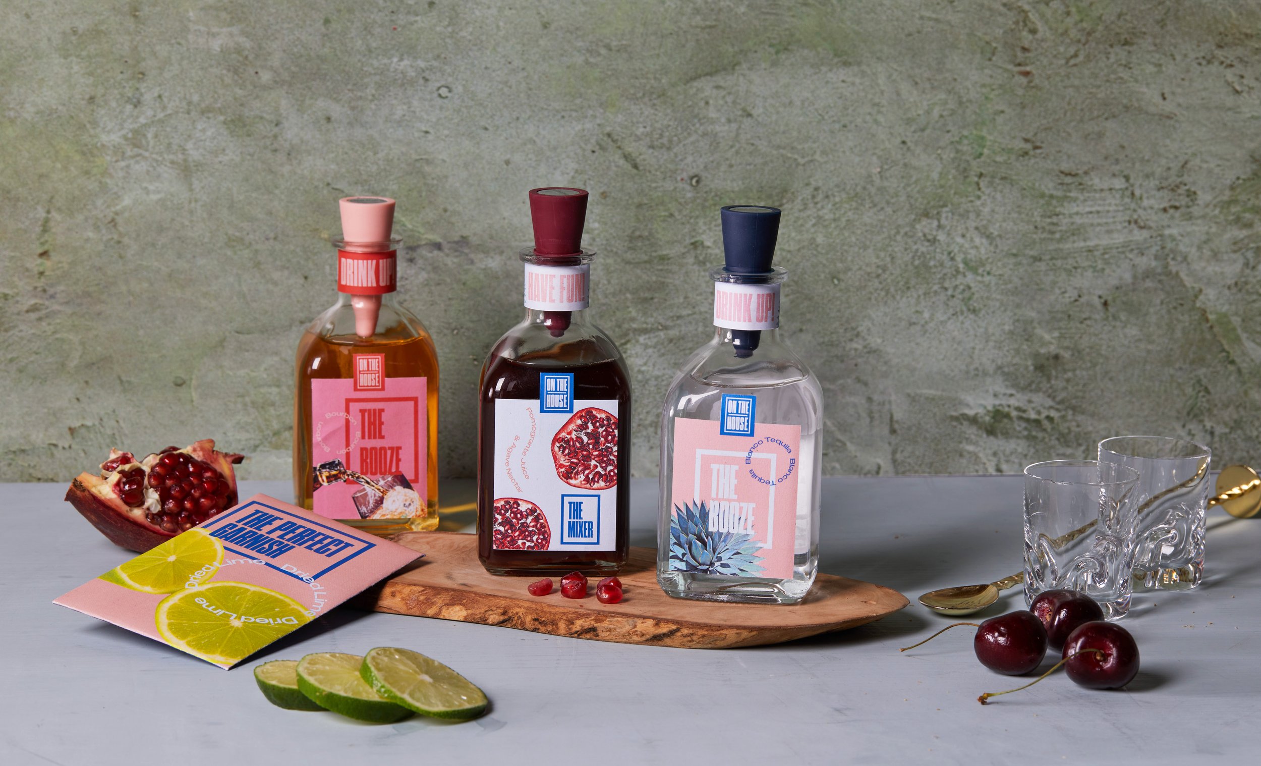
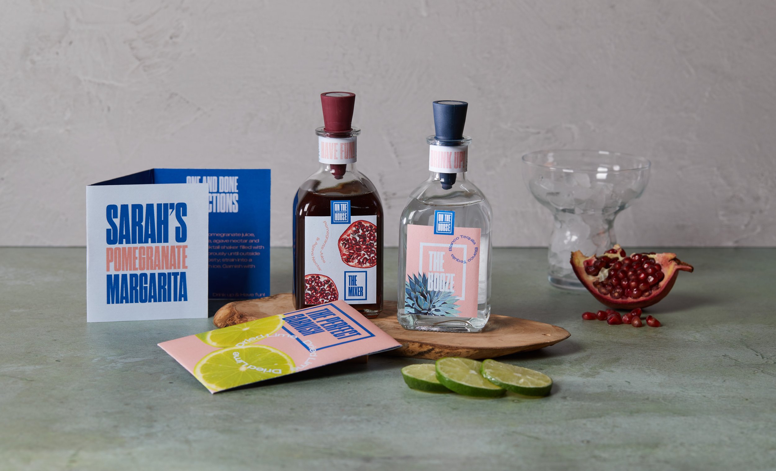
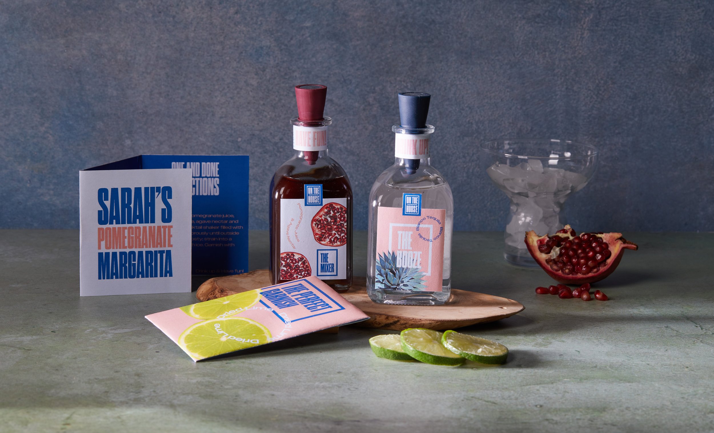
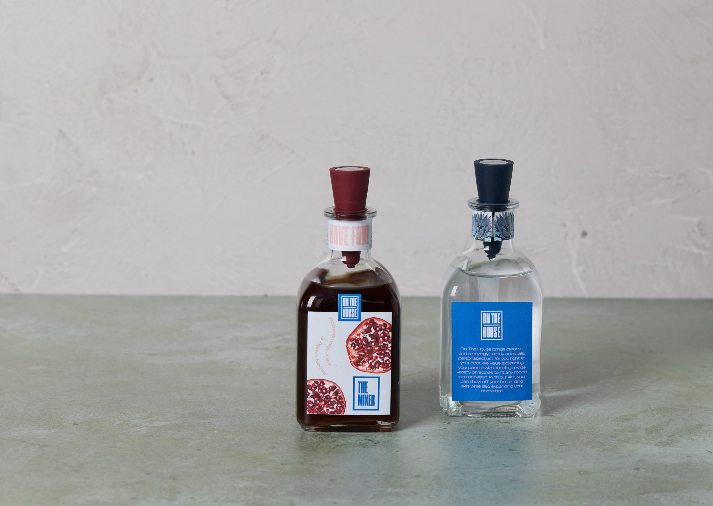
On The House brings creative and amazingly tasty cocktails, personalized just for you right to your door. We value expanding your palette by sending a wide variety of recipes to fit any mood and occasion. With our kits, you can show off your bartending skills while also expanding your home bar! We care about our environment and our way to minimize waste is sending our customers glass bottles for the alcohol and mixer which they will be able to send back to be filled with the alcohol and mixer for the next cocktail. We also include dried fruits and herbs as garnishes to minimize the possibility of rotting food and waste.
What’s Included?
Pregraming with the Logo
The next part of this project was creating the logo. This part of the process was a bit difficult for me as I wanted to expand my portfolio from using primarily icons; I really wanted to focus on typography and finding ways to make my brand still look fun and young. Because I wasn’t used to using primarily type for the design of my projects, it was hard to create a logo that was strong without using any type of icon. I played around a lot with different wordmarks by using unique fonts I found on Behance and Adobe Fonts. I wanted a font that’s big and bold to really help my brand stand out but finding that perfect font took some time.
After playing around with different ideas, I decided to go with a logo that was simple and straight to the point. I also wanted to create a logo that could be easily adaptable to creating secondary logos/elements. After looking at inspiration on Pinterest and Behance, I decided on having a container around the name which gives it a modern look and feel. I also wanted to have my name stacked and equally spaced in order to fit in the container in a way that looked even.
FINAL LOGO
•
FINAL LOGO •
Tipsy with Typography
With my logo being primarily type, the next step was to create a typographic system that will be used throughout the rest of my packaging design. I wanted to continue the display type as my primary font but needed a secondary font in order to create contrast. I wanted a font that was dynamic but still modern and fun. I found that the way I applied the type would make it look fun. I looked through Adobe Fonts for different sans serif fonts as it was already made up in my mind in order to keep the look and feel of my logo. In order to create that contrast, I wanted something that had more breathing space since my logo had type that was somewhat tight. After looking around, I landed on Owners XWide as my secondary font but I wanted to have fun with this font by adding elements to my packaging that will help bring it to life.
Cocktail Color Palette
The next phase was creating a color palette that will catch the eye of the customer. I wanted to create a color palette that gave off the young and fun aesthetic that I first wanted for the brand. I played around with different ideas that could work and when talking with my classmates, I came to the idea of changing the color palette for each month of the year as my subscription service would be sent out each month. I had the idea that I would create two color palettes for the month of January and one for February to start off with. I wanted to keep some type of consistency and to accomplish that, I wanted to have a color that would be able to fit the theme of each month. This color would become a light salmon pink that I found within my January color palette.
FINAL PACKAGING
•
FINAL PACKAGING •
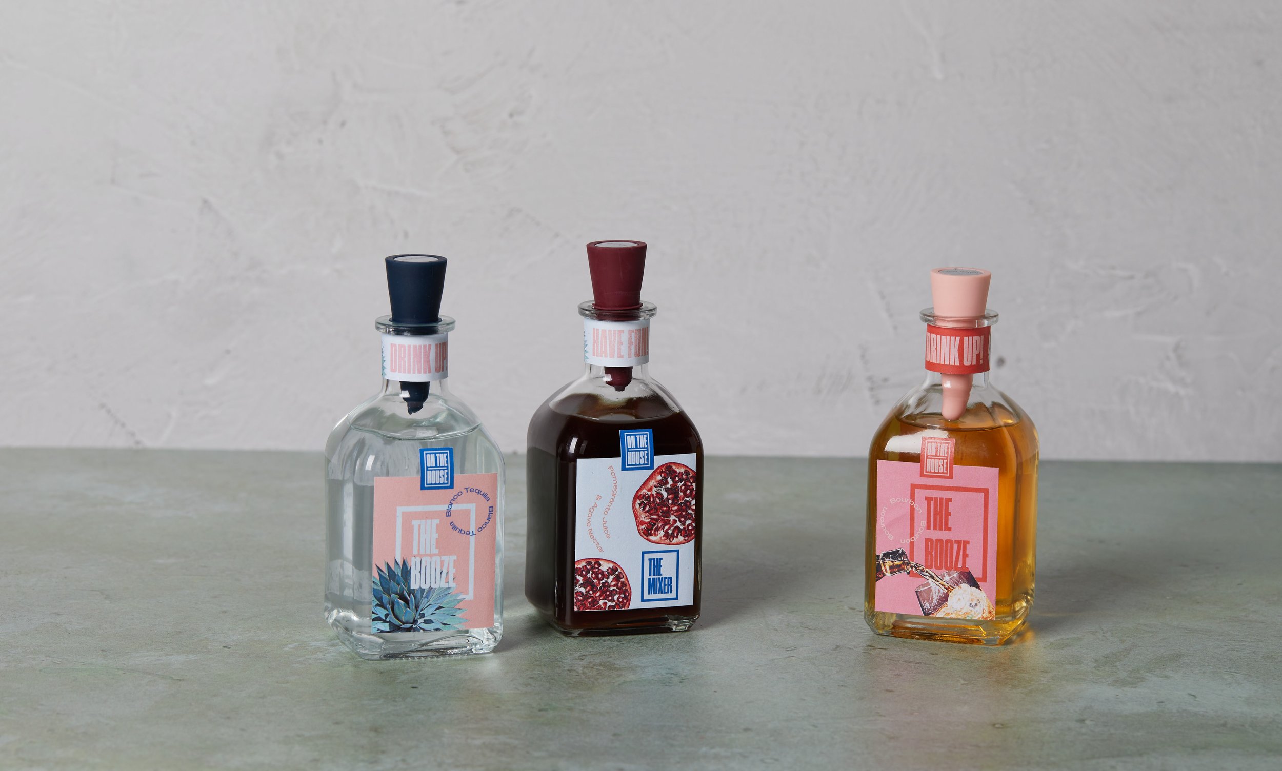
After finalizing the colors, the next part was to start designing the packaging. I conveyed that same fun and young feel I wanted and was able to treat my fonts in a fun way. I designed the labels for the alcohol and mixer from the January edition along with the alcohol for the February edition to give some variety. I also designed recipe cards for each cocktail that provided step-by-step instructions for the customer to be able to replicate the cocktail perfectly. The packets for the dried garnishes were also designed, one for the January edition and one for February.
