On The House
Let’s Start a Tab!
In this packaging project, the major goal was to create a subscription service which we were to create its brand and design it accordingly to relate to our ideal consumer. For my subscription service, I bounced around a couple of ideas and wrote them out to see how I could expand my ideas. After realizing how much room I could add to my ideas, I chose to create a cocktail kit that is delivered to your home which is personalized for each customer. I also wanted to include a sustainability aspect within my brand that I will touch on later on in this case study
Who are we?
The first part of this project was to create a name that will create a path for the look and feel of the brand. I wanted a name that connected with a certain demographic that consisted of young adults that like to drink and have fun at home with friends. I wanted a clever name that related in some way to the idea of a home bar with unique cocktail recipes. With this idea in mind, I created the name ‘On The House’ for my subscription service.
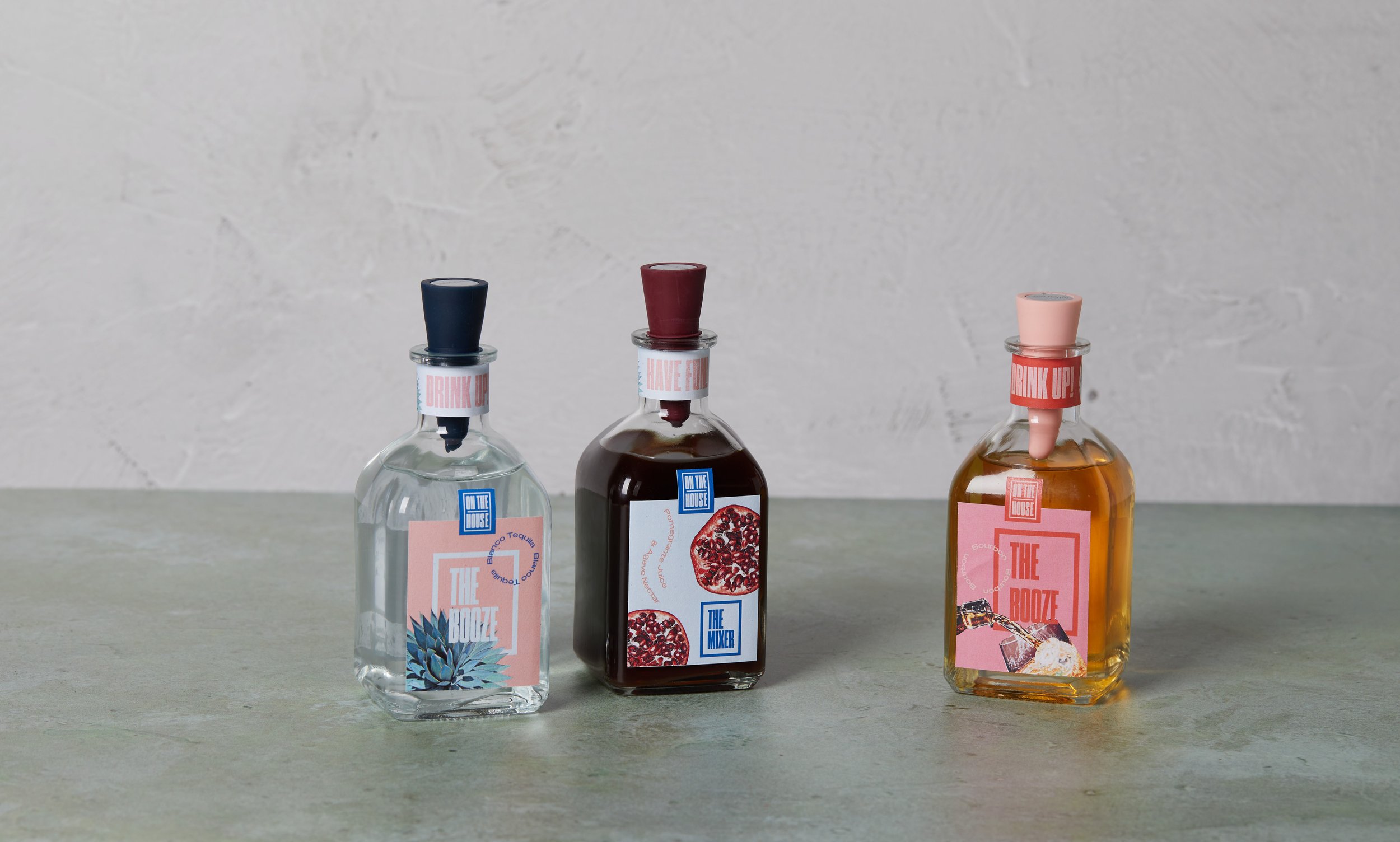
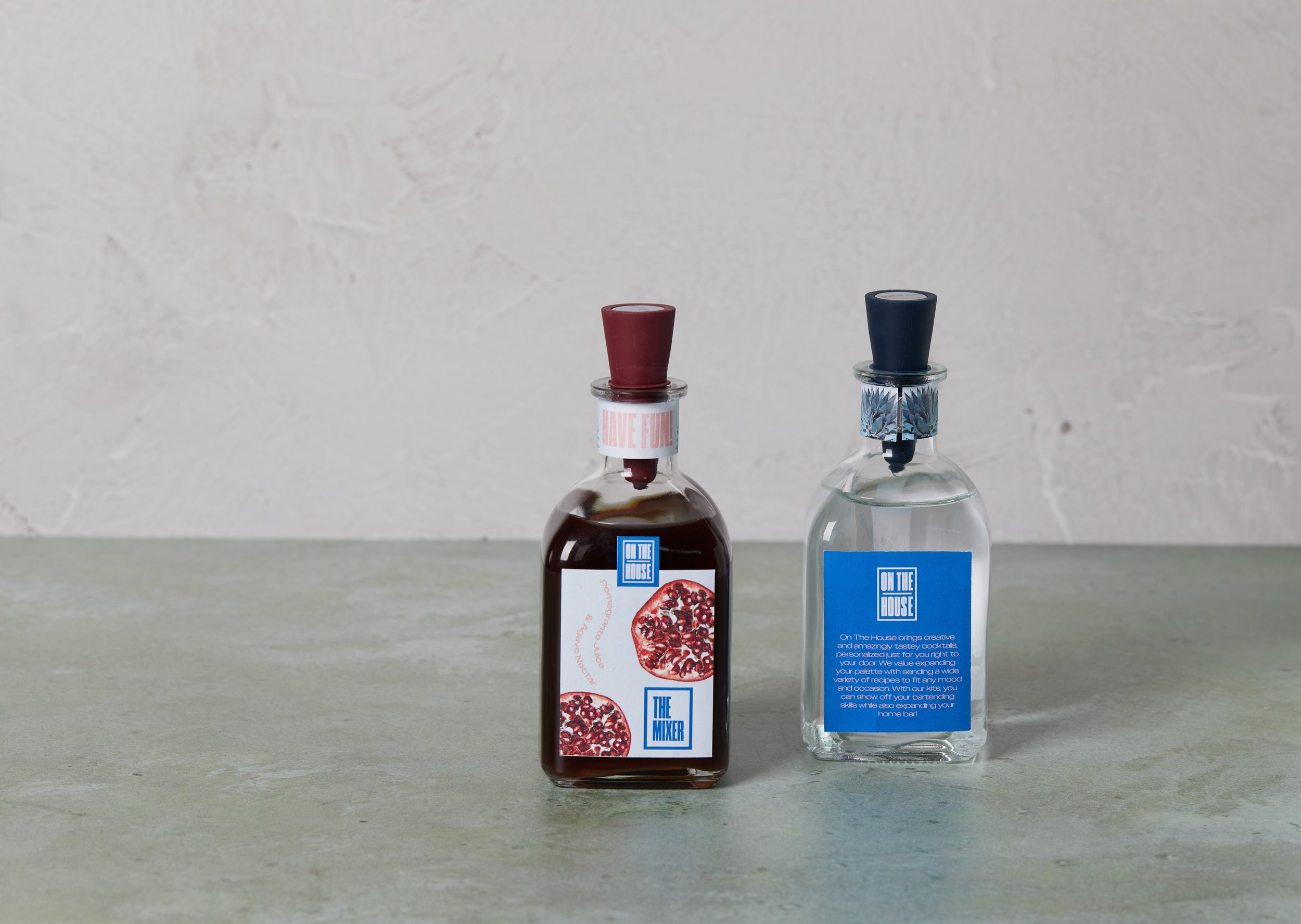
On The House brings creative and amazingly tasty cocktails, personalized just for you right to your door. We value expanding your palette by sending a wide variety of recipes to fit any mood and occasion. With our kits, you can show off your bartending skills while also expanding your home bar! We care about our environment and our way to minimize waste is sending our customers glass bottles for the alcohol and mixer which they will be able to send back to be filled with the alcohol and mixer for the next cocktail. We also include dried fruits and herbs as garnishes to minimize the possibility of rotting food and waste.
What’s Included?
Pregraming with the Logo
The next part of this project was creating the logo. This part of the process was a bit difficult for me as I wanted to expand my portfolio from using primarily icons; I really wanted to focus on typography and finding ways to make my brand still look fun and young. Because I wasn’t used to using primarily type for the design of my projects, it was hard to create a logo that was strong without using any type of icon. I played around a lot with different wordmarks by using unique fonts I found on Behance and Adobe Fonts. I wanted a font that’s big and bold to really help my brand stand out but finding that perfect font took some time.
After playing around with different ideas, I decided to go with a logo that was simple and straight to the point. I also wanted to create a logo that could be easily adaptable to creating secondary logos/elements. After looking at inspiration on Pinterest and Behance, I decided on having a container around the name which gives it a modern look and feel. I also wanted to have my name stacked and equally spaced in order to fit in the container in a way that looked even.
FINAL LOGO
•
FINAL LOGO •
Tipsy with Typography
With my logo being primarily type, the next step was to create a typographic system that will be used throughout the rest of my packaging design. I wanted to continue the display type as my primary font but needed a secondary font in order to create contrast. I wanted a font that was dynamic but still modern and fun. I found that the way I applied the type would make it look fun. I looked through Adobe Fonts for different sans serif fonts as it was already made up in my mind in order to keep the look and feel of my logo. In order to create that contrast, I wanted something that had more breathing space since my logo had type that was somewhat tight. After looking around, I landed on Owners XWide as my secondary font but I wanted to have fun with this font by adding elements to my packaging that will help bring it to life.
Cocktail Color Palette
The next phase was creating a color palette that will catch the eye of the customer. I wanted to create a color palette that gave off the young and fun aesthetic that I first wanted for the brand. I played around with different ideas that could work and when talking with my classmates, I came to the idea of changing the color palette for each month of the year as my subscription service would be sent out each month. I had the idea that I would create two color palettes for the month of January and one for February to start off with. I wanted to keep some type of consistency and to accomplish that, I wanted to have a color that would be able to fit the theme of each month. This color would become a light salmon pink that I found within my January color palette.
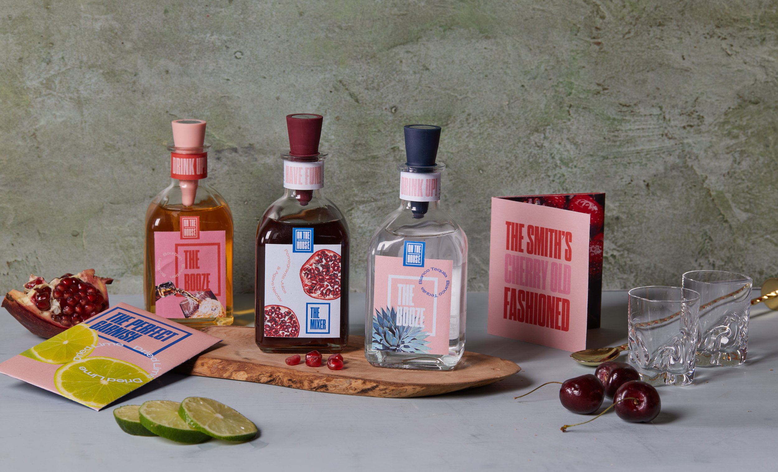
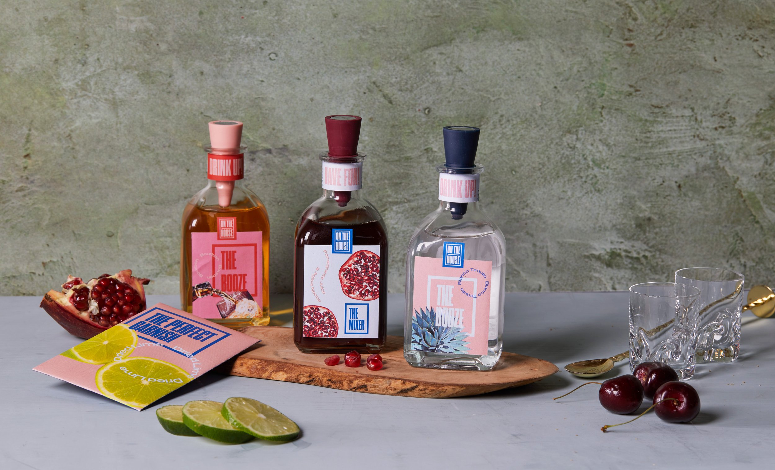
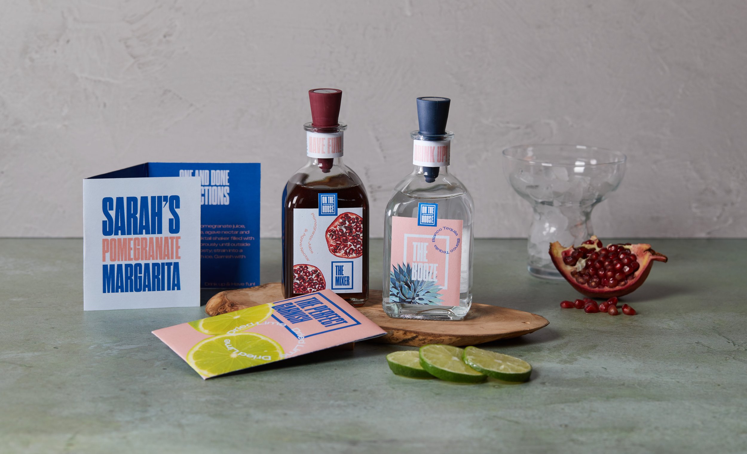
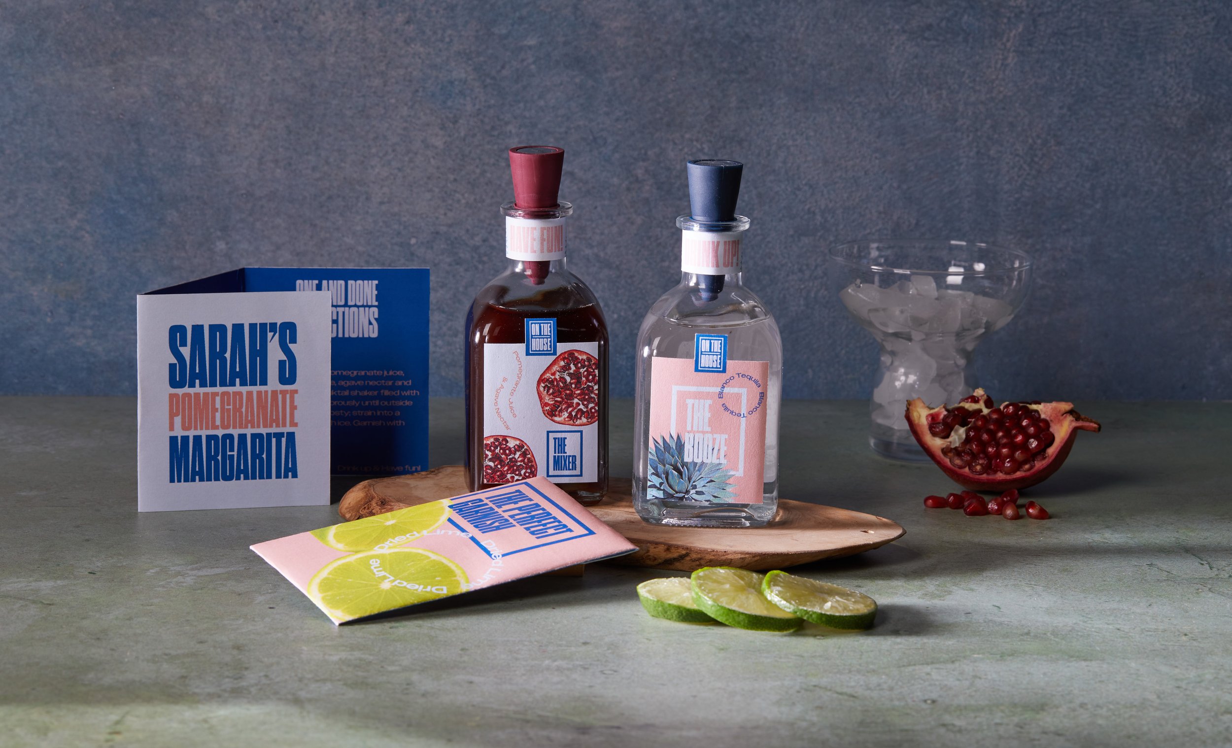
FINAL PACKAGING
•
FINAL PACKAGING •
After finalizing the colors, the next part was to start designing the packaging. I conveyed that same fun and young feel I wanted and was able to treat my fonts in a fun way. I designed the labels for the alcohol and mixer from the January edition along with the alcohol for the February edition to give some variety. I also designed recipe cards for each cocktail that provided step-by-step instructions for the customer to be able to replicate the cocktail perfectly. The packets for the dried garnishes were also designed, one for the January edition and one for February.
